Angular Material Card Example | Angular mat-card
Hi Dev,
In this example, i will show you angular material card example. this example will help you angular 9 material card example. Here you will learn angular material mat-card example. you'll learn angular material card grid example.
Angular Material provides a wide range of web components which are very easy to implement and use in Angular applications for creating card, badge, forms, steps, menu etc. In this example we will learn how to create step by step form in angular app using material card.
I will show you how to use material card ui in angular 6, angular 7, angular 8, angular 9, angular 10, angular 11, angular 12, angular 13, angular 14, angular 15, angular 16 and angular 17. i will give you very basic example of angular material design card so you can use in your application.
angular material "mat-card" provide following sections.
| Element | Description |
|---|---|
| <mat-card-title> | Card title |
| <mat-card-subtitle> | Card subtitle |
| <mat-card-content> | Primary card content. Intended for blocks of text |
| <img mat-card-image> | Card image. Stretches the image to the container width |
| <mat-card-actions> | Container for buttons at the bottom of the card |
| <mat-card-footer> | Section anchored to the bottom of the card |
angular material "mat-card-header" provide following sections.
| Element | Description |
|---|---|
| <mat-card-title> | A title within the header |
| <mat-card-subtitle> | A subtitle within the header |
| <img mat-card-avatar> | An image used as an avatar within the header |
Create New App
If you are doing example from scratch then You can easily create your angular app using bellow command:
ng new newMat
Add Material Design
Now in this step, we need to just install material design theme in our angular application. so let's add as like bellow:
ng add @angular/material
Cmd like bellow:
Installing packages for tooling via npm.
Installed packages for tooling via npm.
? Choose a prebuilt theme name, or "custom" for a custom theme: Indigo/Pink
[ Preview: https://material.angular.io?theme=indigo-pink ]
? Set up global Angular Material typography styles? Yes
? Set up browser animations for Angular Material? Yes
Import Material Card Module
Here, we will simply import MatCardModule, MatButtonModule and BrowserAnimationsModule module for creating very simple example. so let's import on module.ts file.
src/app/app.module.ts
import { BrowserModule } from '@angular/platform-browser';
import { NgModule } from '@angular/core';
import { AppComponent } from './app.component';
import { BrowserAnimationsModule } from '@angular/platform-browser/animations';
import {MatCardModule} from '@angular/material/card';
import {MatButtonModule} from '@angular/material/button';
@NgModule({
declarations: [
AppComponent
],
imports: [
BrowserModule,
BrowserAnimationsModule,
MatCardModule,
MatButtonModule
],
providers: [],
bootstrap: [AppComponent]
})
export class AppModule { }
Example 1:
we will use matBadge for creating Card in angular app. so let's update follow html file.
src/app/app.component.html
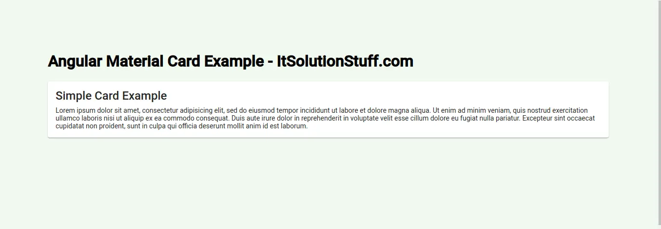
<h1>Angular Material Card Example - ItSolutionStuff.com</h1>
<mat-card>
<mat-card-title>Simple Card Example</mat-card-title>
<mat-card-content>
<p>
Lorem ipsum dolor sit amet, consectetur adipisicing elit, sed do eiusmod
tempor incididunt ut labore et dolore magna aliqua. Ut enim ad minim veniam,
quis nostrud exercitation ullamco laboris nisi ut aliquip ex ea commodo
consequat. Duis aute irure dolor in reprehenderit in voluptate velit esse
cillum dolore eu fugiat nulla pariatur. Excepteur sint occaecat cupidatat non
proident, sunt in culpa qui officia deserunt mollit anim id est laborum.
</p>
</mat-card-content>
</mat-card>
Now you can see layout as like bellow:
Example 2:
Here, we will create simple example with add one button, when you click on it. it will increase number of badge. so see bellow example.
src/app/app.component.html
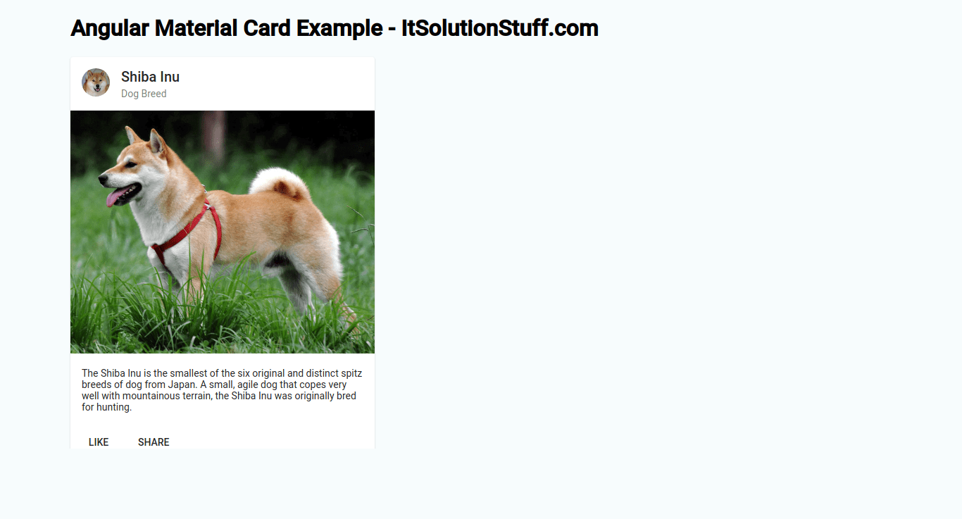
<h1>Angular Material Card Example - ItSolutionStuff.com</h1>
<mat-card class="example-card">
<mat-card-header>
<div mat-card-avatar class="example-header-image"></div>
<mat-card-title>Shiba Inu</mat-card-title>
<mat-card-subtitle>Dog Breed</mat-card-subtitle>
</mat-card-header>
<img mat-card-image src="https://material.angular.io/assets/img/examples/shiba2.jpg" alt="Photo of a Shiba Inu">
<mat-card-content>
<p>
The Shiba Inu is the smallest of the six original and distinct spitz breeds of dog from Japan.
A small, agile dog that copes very well with mountainous terrain, the Shiba Inu was originally
bred for hunting.
</p>
</mat-card-content>
<mat-card-actions>
<button mat-button>LIKE</button>
<button mat-button>SHARE</button>
</mat-card-actions>
</mat-card>
Now you can see layout as like bellow:
Now you can run by bellow command:
ng serve
I hope it can help you...