Angular Material Tooltip Example
Hello,
This article will provide example of angular tooltip example. This tutorial will give you simple example of angular material tooltip example. i would like to show you angular 9 material tooltip example. if you want to see example of angular matTooltip example then you are a right place. Let's get started with angular md tooltip position example.
I will show you how to use material tooltip in angular 6, angular 7, angular 8, angular 9, angular 10, angular 11, angular 12, angular 13, angular 14, angular 15, angular 16 and angular 17. you can also set tooltip position with after, before, above, below, left and right.
So, let's see simple example
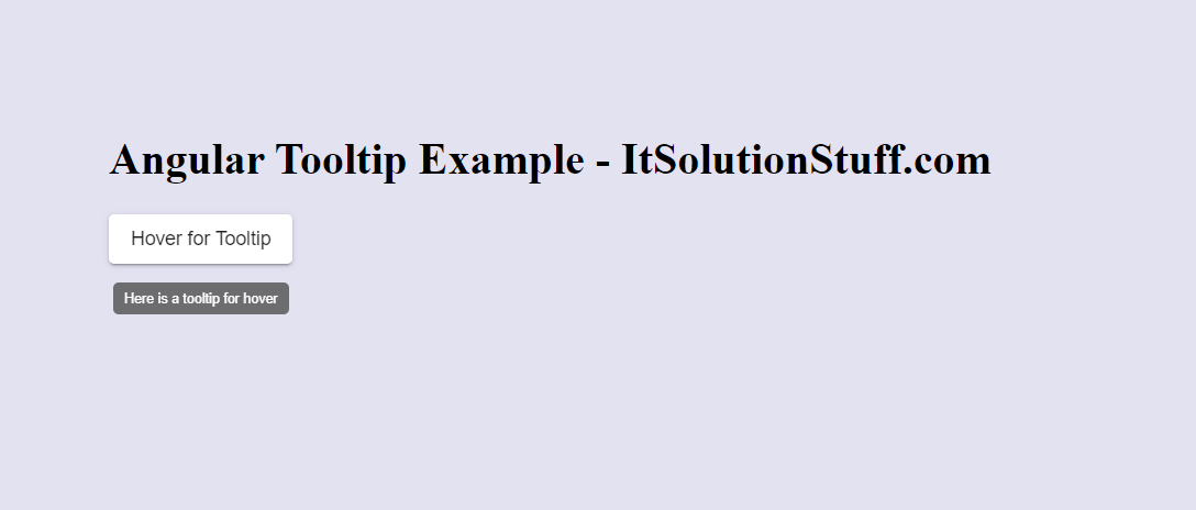
You can see bellow layout for demo:
Create New App
If you are doing example from scratch then You can easily create your angular app using bellow command:
ng new app-material
Add Material Design
Now in this step, we need to just install material design theme in our angular application. so let's add as like bellow:
ng add @angular/material
Cmd like bellow:
Installing packages for tooling via npm.
Installed packages for tooling via npm.
? Choose a prebuilt theme name, or "custom" for a custom theme: Indigo/Pink
[ Preview: https://material.angular.io?theme=indigo-pink ]
? Set up global Angular Material typography styles? Yes
? Set up browser animations for Angular Material? Yes
Basic Material Slider Toggle Button
Here, we will create very simple example. first we need to import MatTooltipModule, MatButtonModule, BrowserAnimationsModule for this example.
so let's update app.module.ts, app.component.ts and app.component.html.
Let's follow step:
src/app/app.module.ts
import { NgModule } from '@angular/core';
import { BrowserModule } from '@angular/platform-browser';
import { FormsModule } from '@angular/forms';
import { AppComponent } from './app.component';
import {MatButtonModule} from '@angular/material/button';
import {MatTooltipModule} from '@angular/material/tooltip';
import { BrowserAnimationsModule } from '@angular/platform-browser/animations';
@NgModule({
imports: [ BrowserModule, FormsModule, MatButtonModule, MatTooltipModule, BrowserAnimationsModule ],
declarations: [ AppComponent],
bootstrap: [ AppComponent ]
})
export class AppModule { }
src/app/app.component.html
Here, you can also set tooltip position as bellow values:
matTooltipPosition: ['after', 'before', 'above', 'below', 'left', 'right']
<h1>Angular Tooltip Example - ItSolutionStuff.com</h1>
<button mat-raised-button
matTooltip="Here is a tooltip for hover">
Hover for Tooltip
</button>
<button mat-raised-button
matTooltipPosition="right"
matTooltip="Here is a tooltip for hover">
Tooltip Right
</button>
You can easily run by following command:
ng serve
I hope it can help you...